Corporate identity for SKUDO
Skudo is a leading global provider of innovative security products and systems. Thanks to the strongest development team and continuous innovation, the company has been a leader in the market of video surveillance and security systems for several years.
Task: to develop the company's corporate identity
STAGES:
1. Conceptualization.
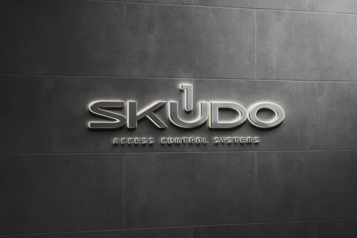
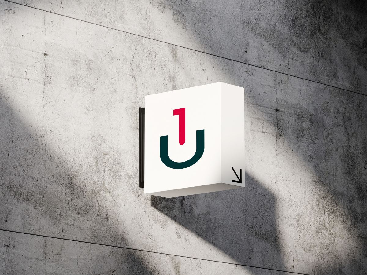
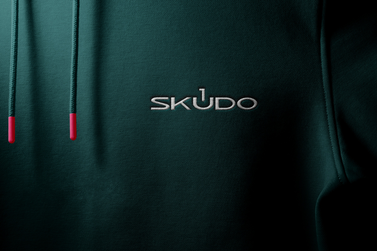
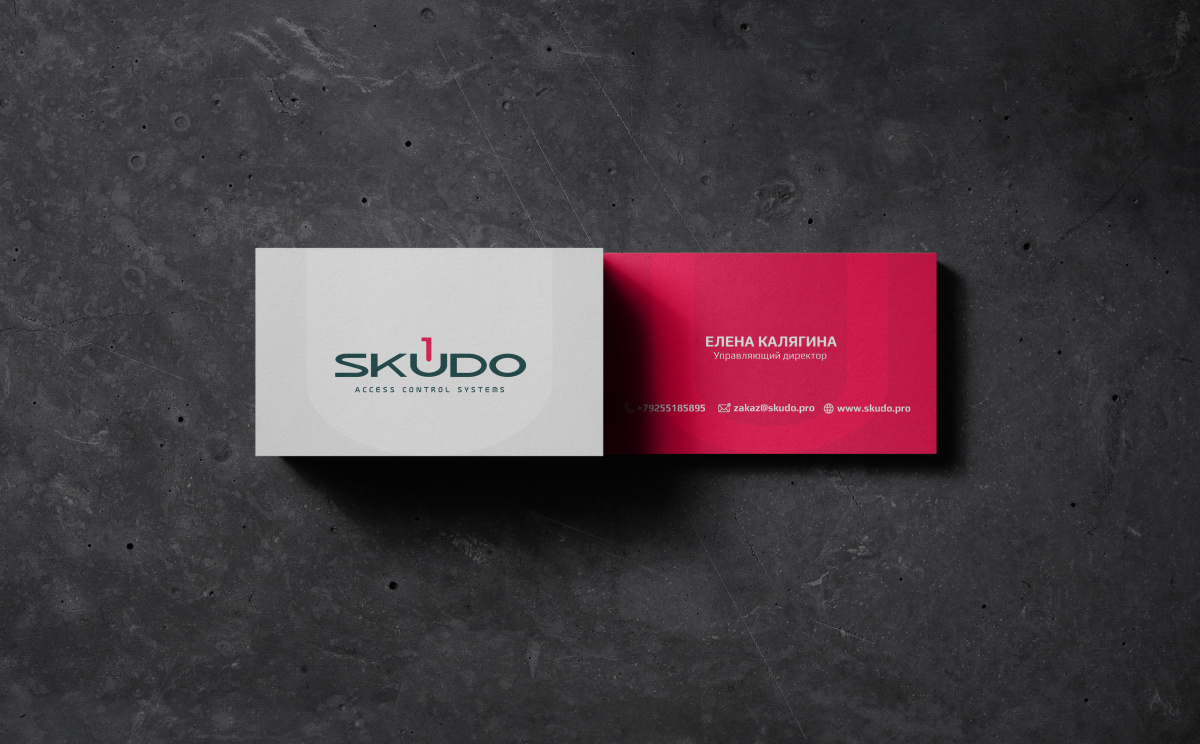
The concept is based on the idea of combining images: the number 1 (niche leadership perspective), the lock, the letter U, the symbol of “system launch”.
2. Palette Selection.
Color combinations:
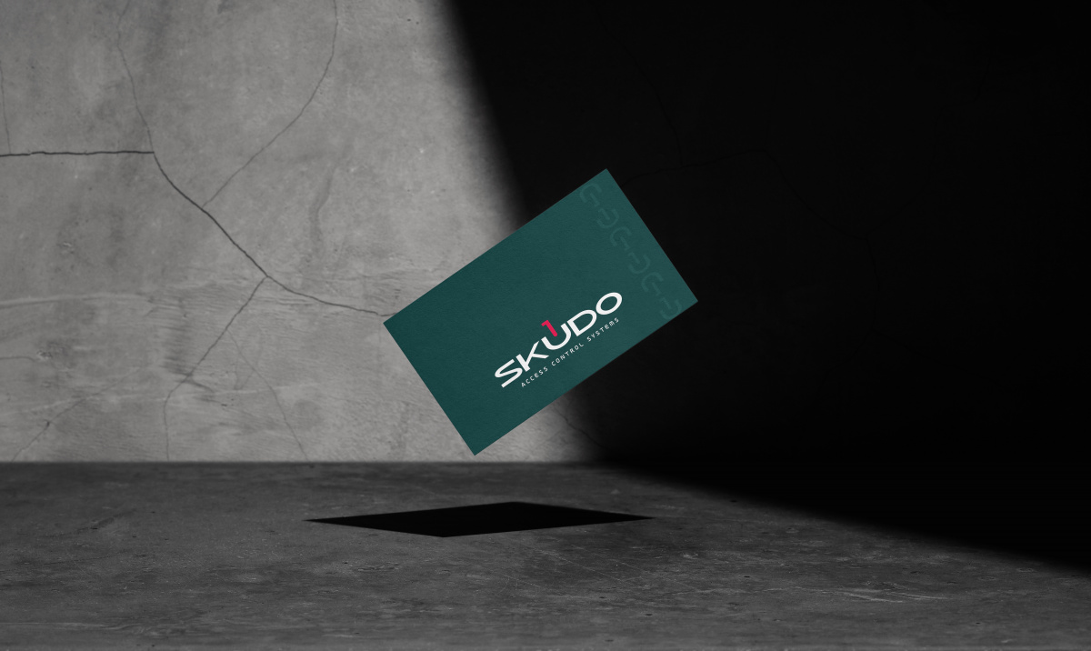
- dark green - striving for stability, reliability and confidence.
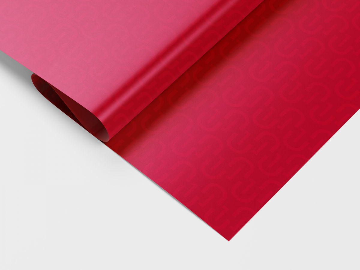
- crimson - passion, fire, unselfishness, rapid development, impulses.
- dark gray and light gray - additional colors.
The font was drawn specially for this project.
3. Drawing of different design options.
The client was offered 3 logo options.
4. Working with the client, making edits.
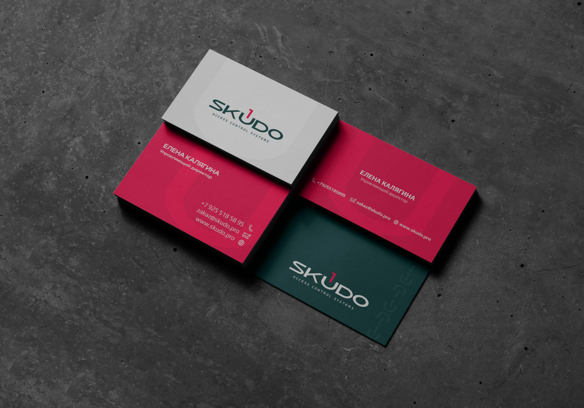
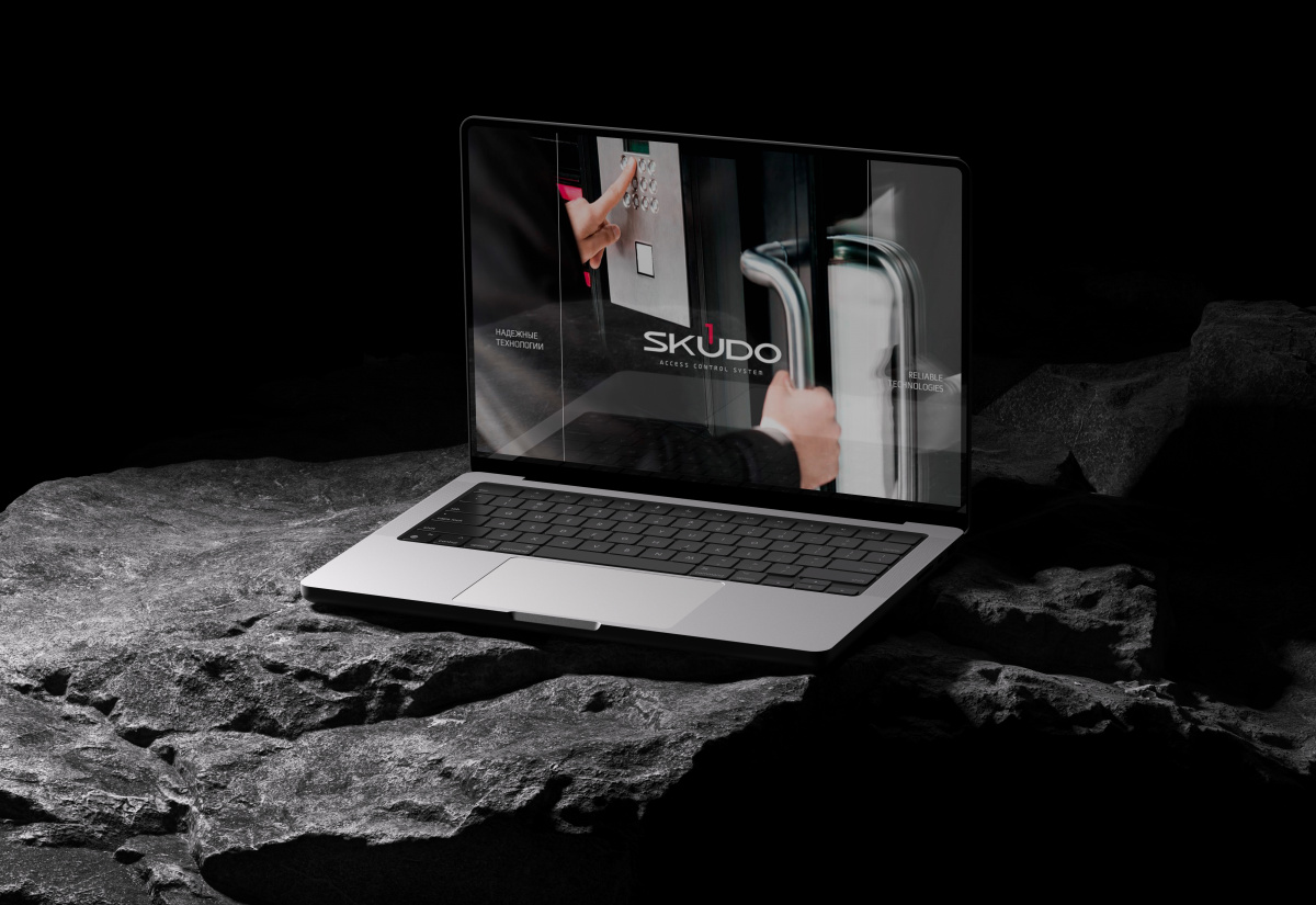
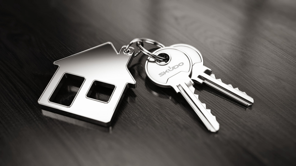
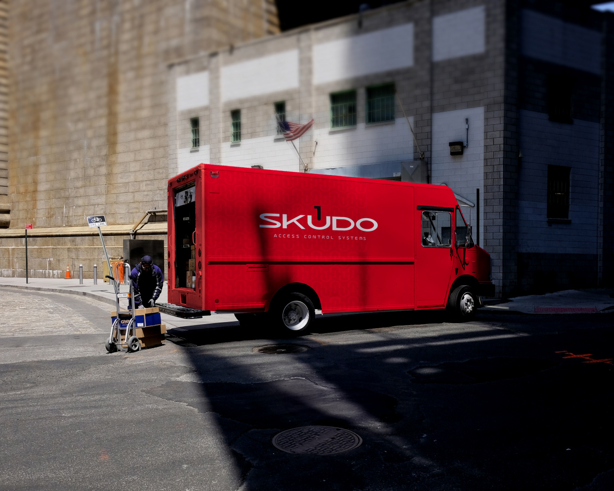
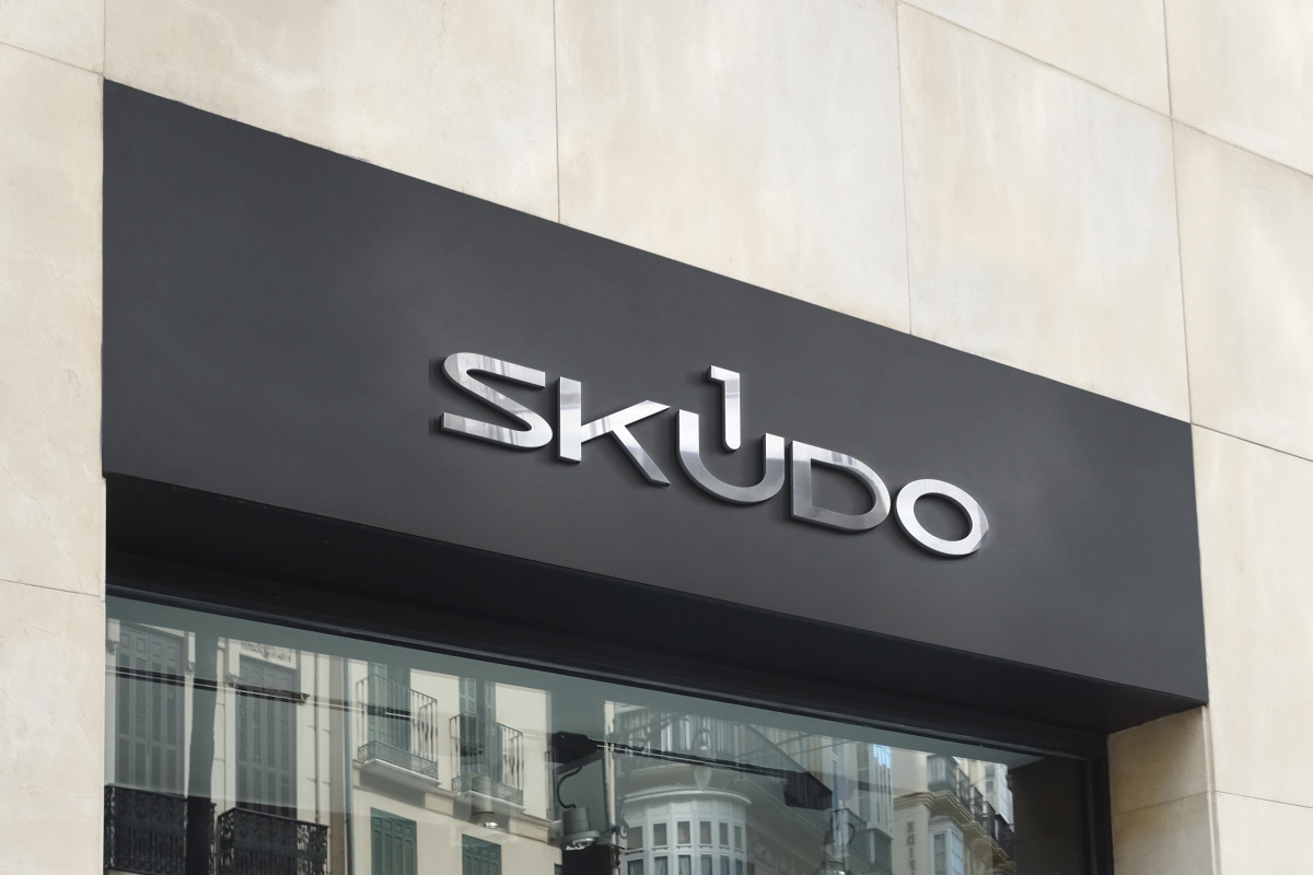
Due to the harmonious and universal image of the logo, it can be used for different purposes: branding of polygraphy, entrance groups, souvenir products.Gallery