Corporate identity for Cosmes Clinic
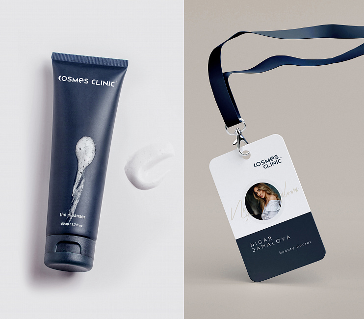
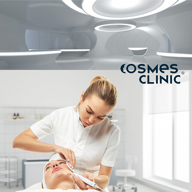
Creating a brand style for Cosmes Clinic. Cosmes Clinic is a prestigious clinic that specializes in three areas of medicine: cosmetology, dermatology, and nursing.
Task: to use images of "space" / futurism in the logo concepts
Style - conceptual, futuristic. Clients should feel that they have come to a clinic, not a salon. The color palette reflects the status and prestige of the brand.
Stages:
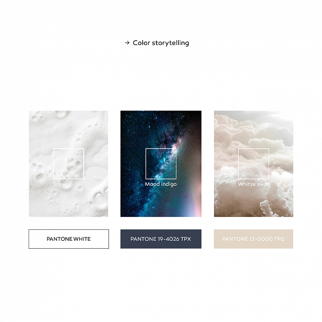
- Choosing a palette.
- galactic space (dark blue)
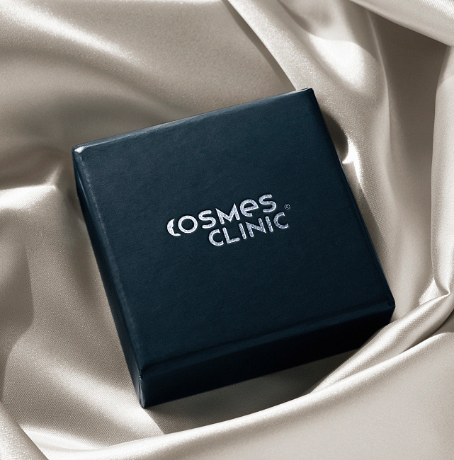
- amber sun reflections on clouds (soft beige)
- snow-white foam - a sign of cleanliness
+ the idea of "eco" can be visualized in color: in phyto-paintings on the walls or by introducing eco-services for vegans or a special line of plant-based skin care products. An additional palette may include cool shades of green.
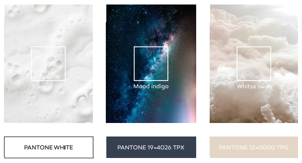
- Brand storytelling of the color palette for the project:
The graphic association of the phonetic "falling into" in the naming in the form of a crescent moon - a symbol of space and futurism (as the idea of new technologies in medicine). The aesthetic "edge" of science and the beauty industry as a whole. - Several logo options were drawn.
The client was presented with three logo options that incorporated second-order associations.
- Working with the client to choose the final logo option.
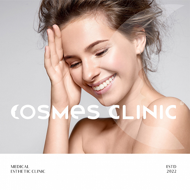
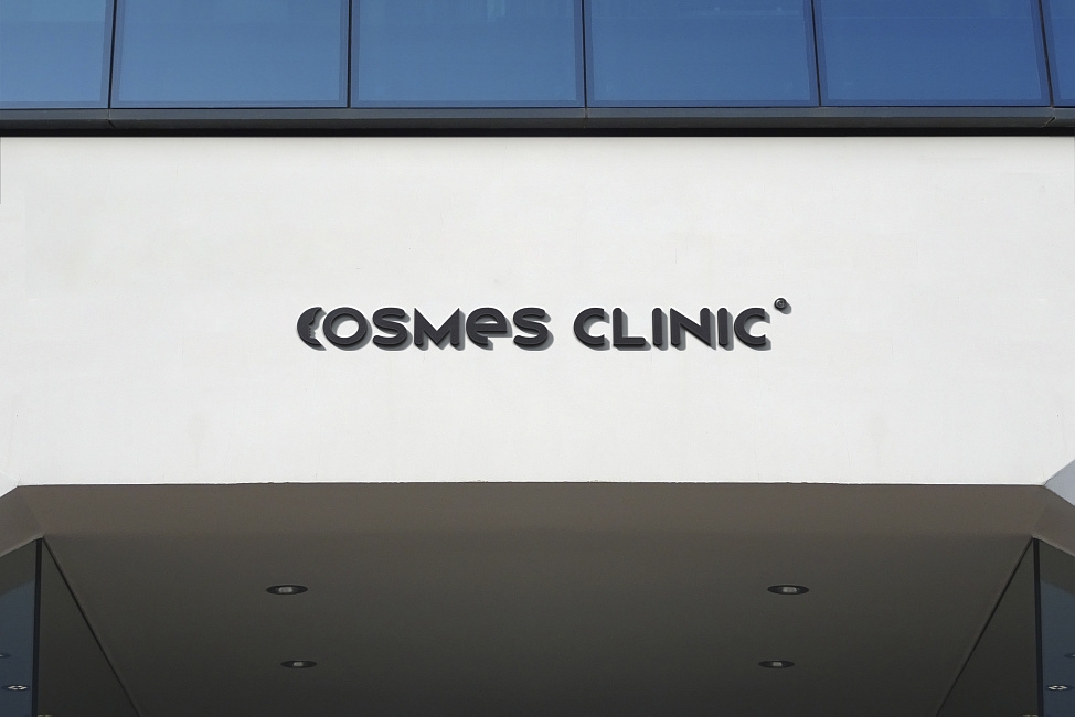
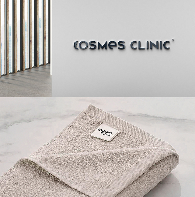
The logo concept is based on associations: the image of a crescent moon and the face of a girl peeking out from behind the letter "O." The naming font is hand-drawn with soft curves, reminiscent of shapes and futuristic objects. The naming is easy to remember and creates a bright image. The symbol © (the first letter of the word "copyright") – the font was specifically developed by our designer for this project.


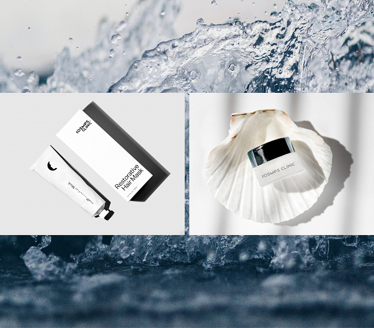
The concise and versatile image of the logo allows it to be used as a trademark for limited skincare products. In addition, the logo can be used for branding the image printing materials of the clinic.

