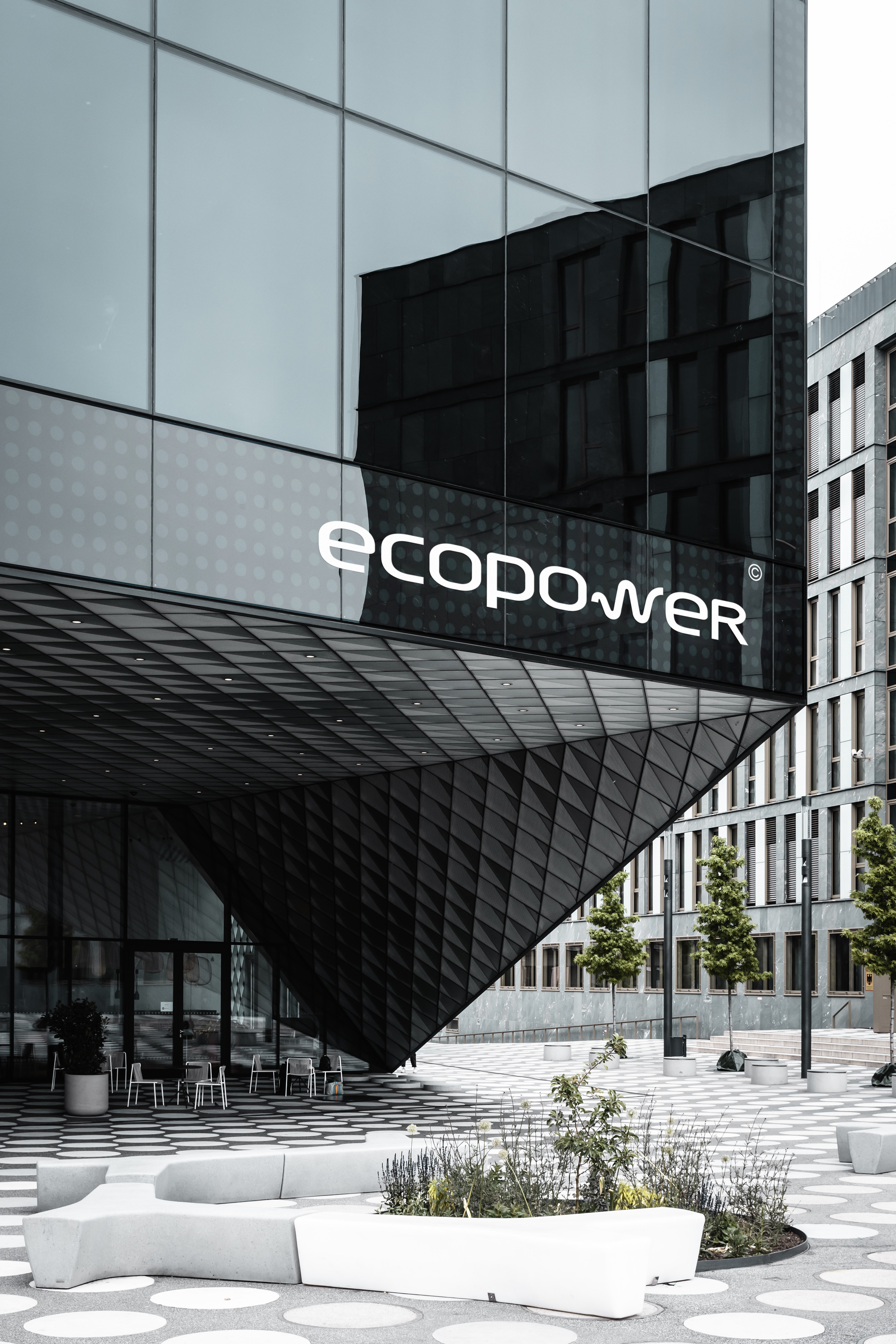
Logo development for EcoPower
The IT Alliance Group apply to the ACEX Drive team with a request to create a logo for EcoPower.
ABOUT THE COMPANY:
The IT Alliance was established in 2010. It started as a local organization engaged in refilling cartridges. Today the company has grown to a full-fledged IT integrator with its own IT solutions that are being implemented in companies and enterprises throughout the country.

NAMING: EcoPower
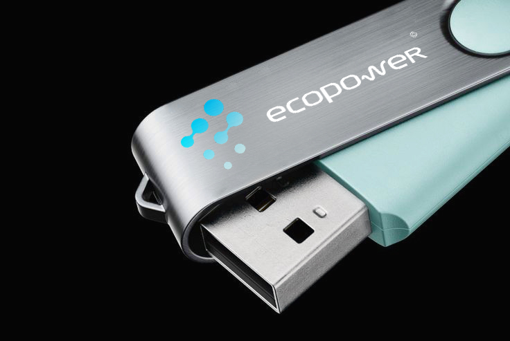
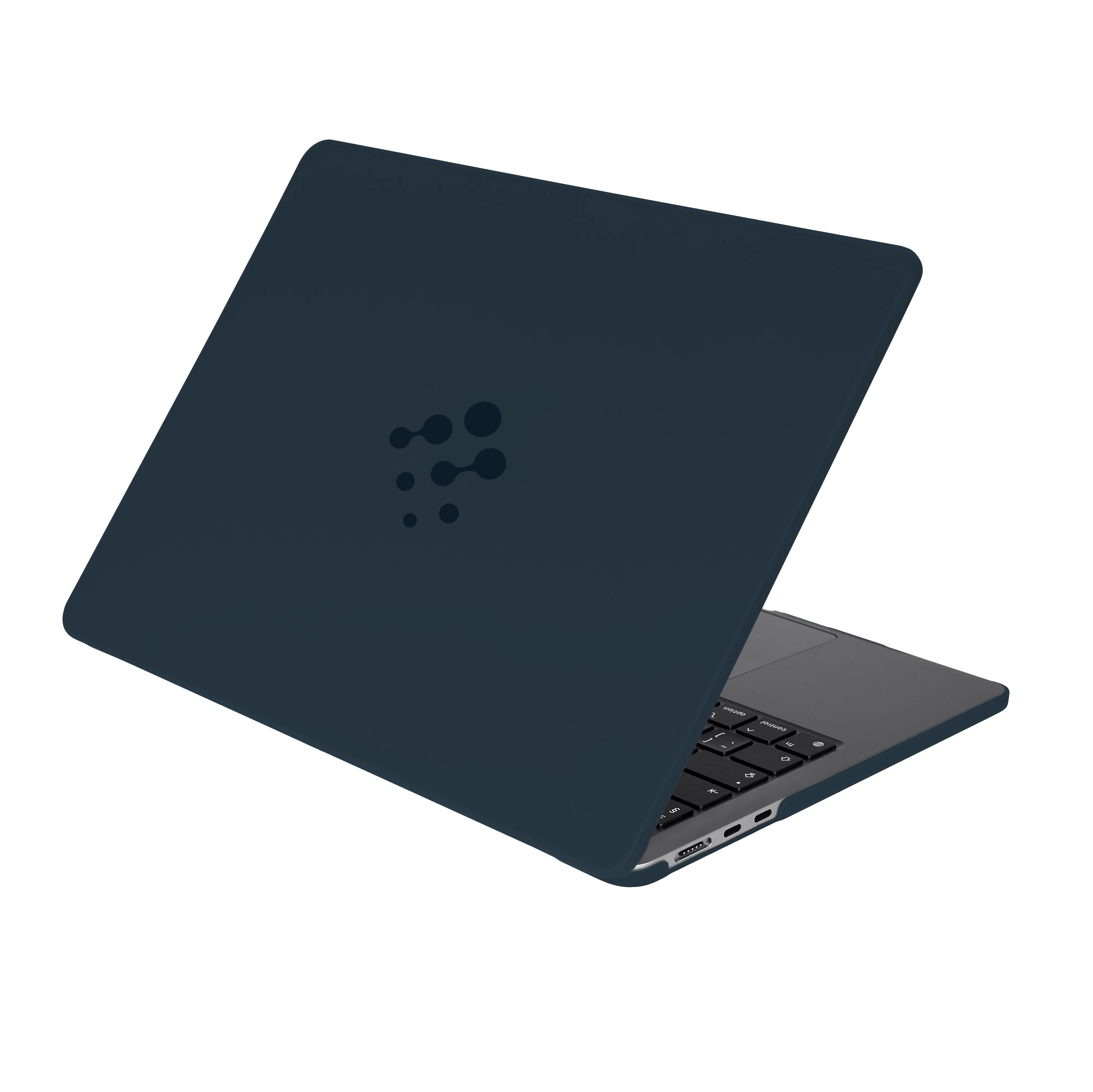
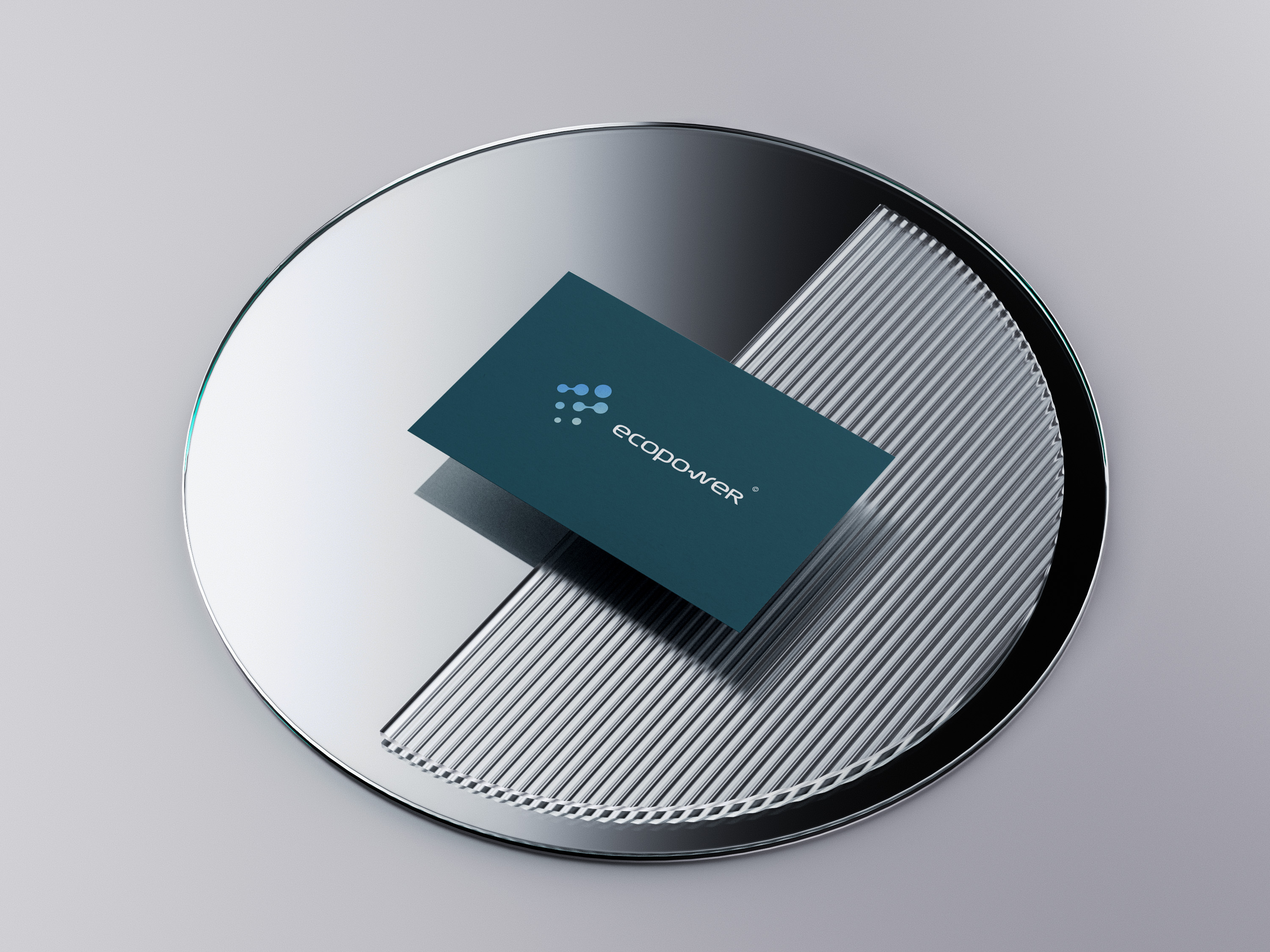
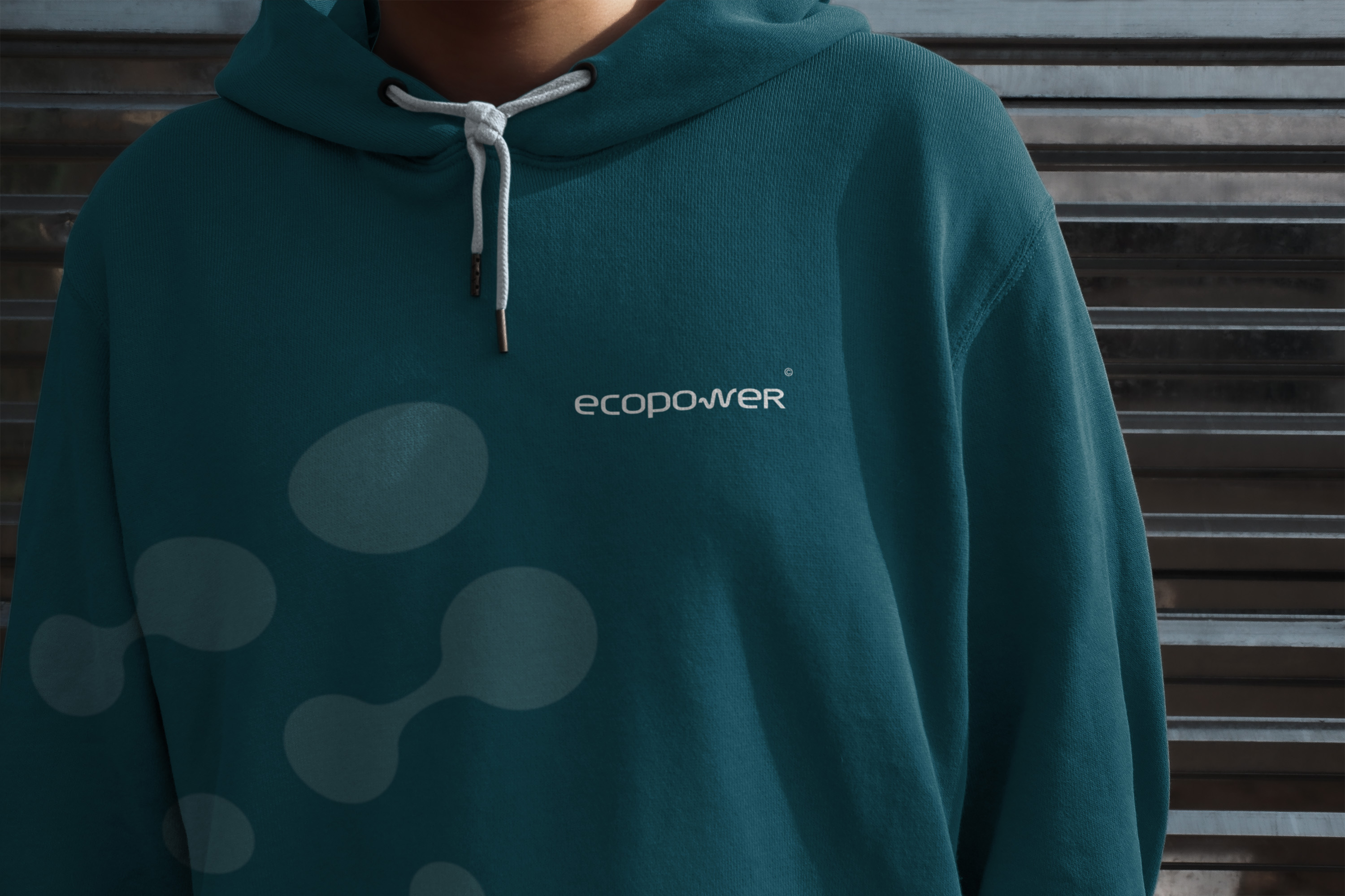
NAMING VALUE: Power and environmental friendliness
When designing the logo, we tried to reflect the company's philosophy in it: a practical and eco-friendly approach to work.

The idea of the logo was as follows:
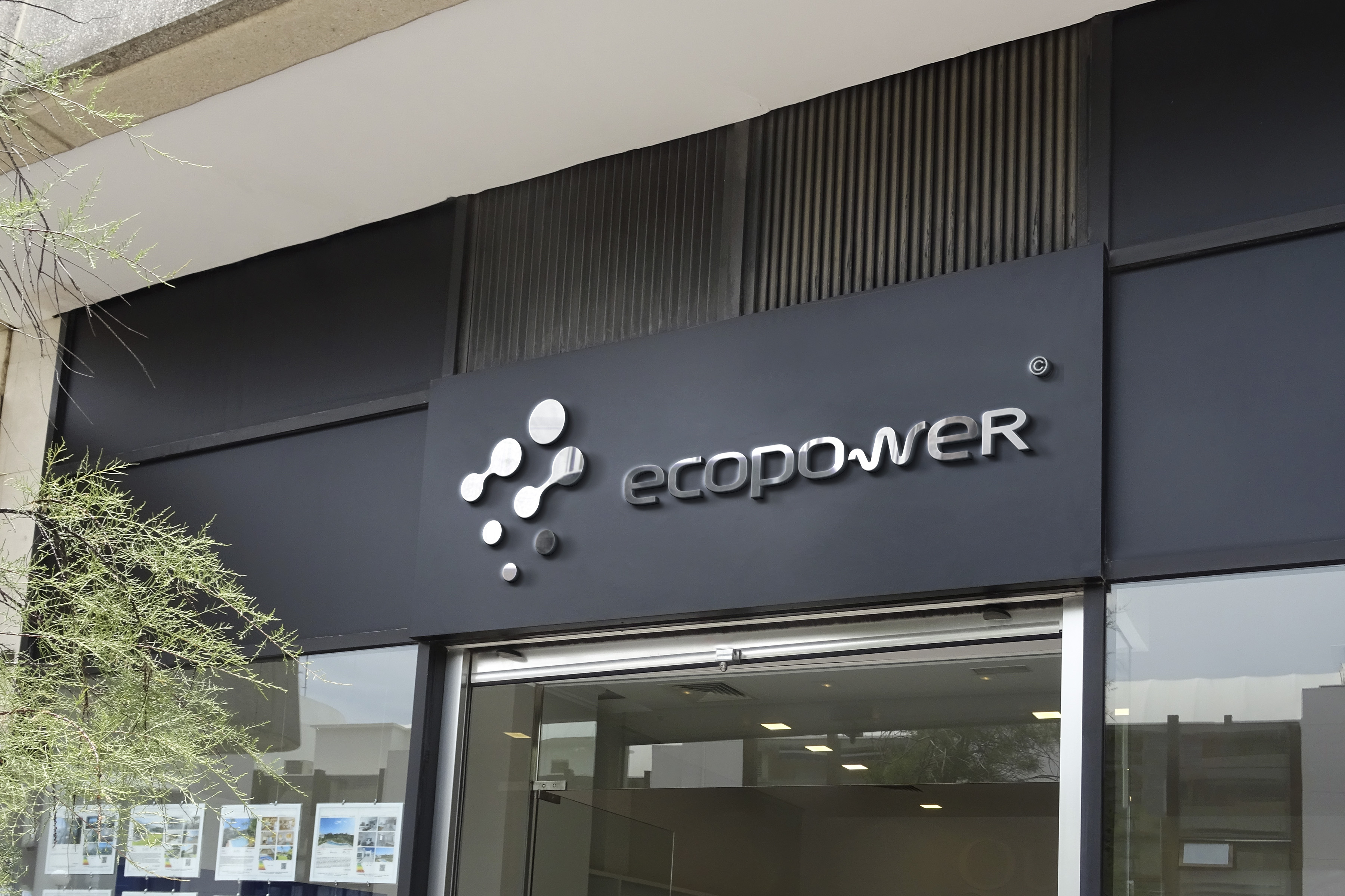
- Focus on the natural color palette - green, gray, blue.
- A multi-faceted image showing the process of "electron division" in the shape of the letter E.
- The process of evaporation, filtration, purification of air is an alternative to the image of a "leaf". As an interpretation of the word "environmental friendliness".
- The manufacturability of the company is reflected in the letter "w", which is depicted in the form of an electric cable.
- Streamlined shapes without sharp corners.
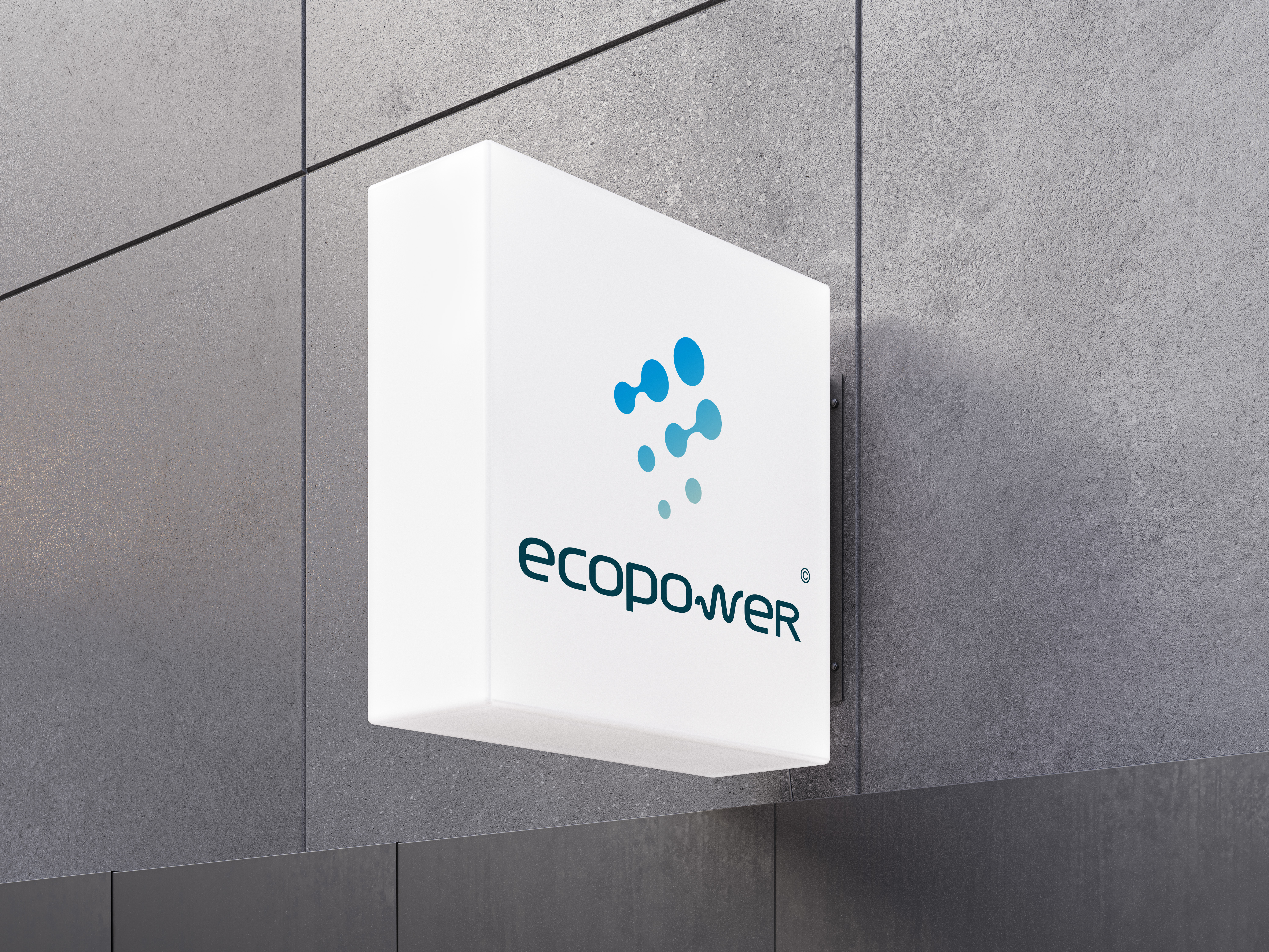
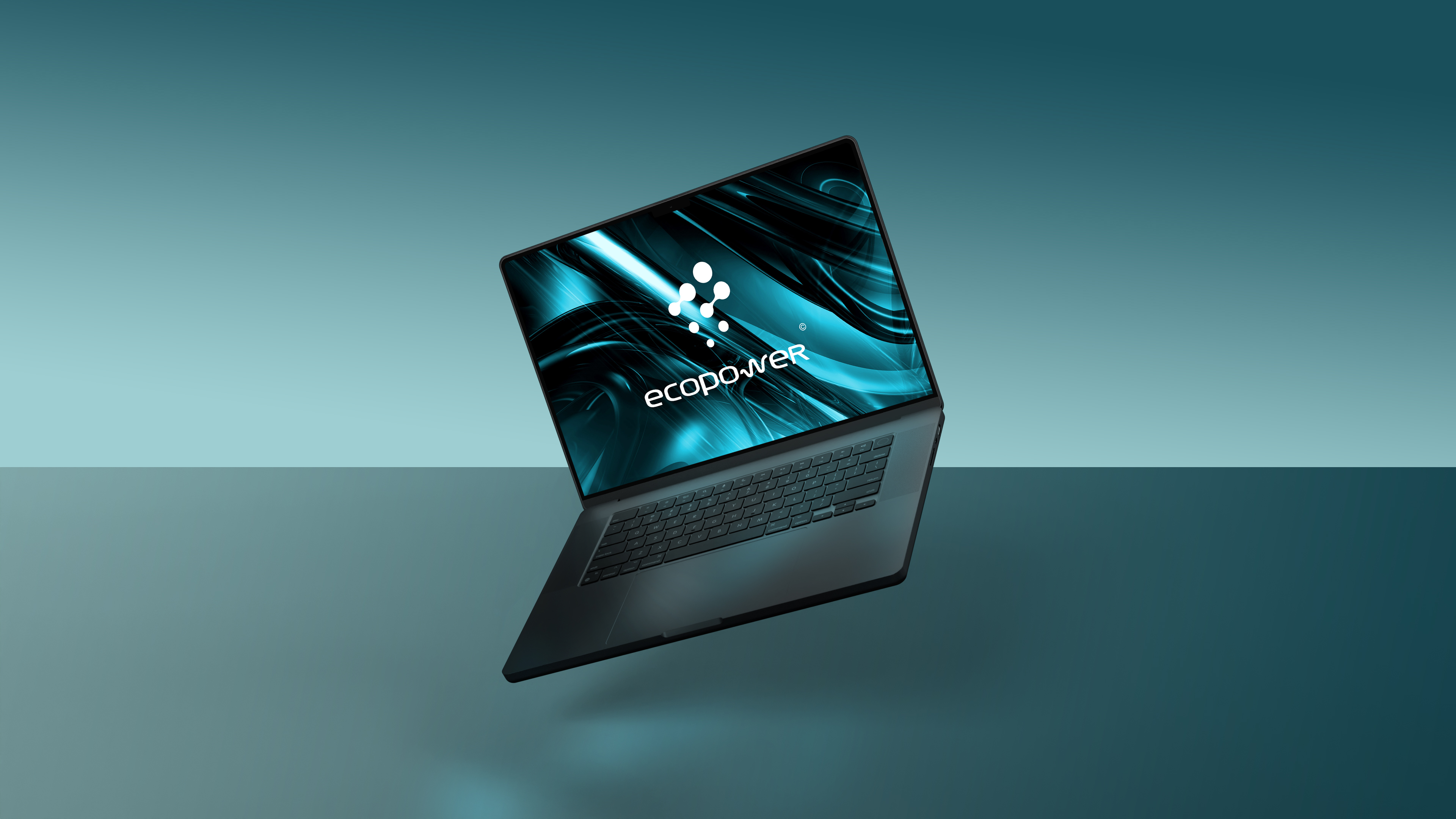
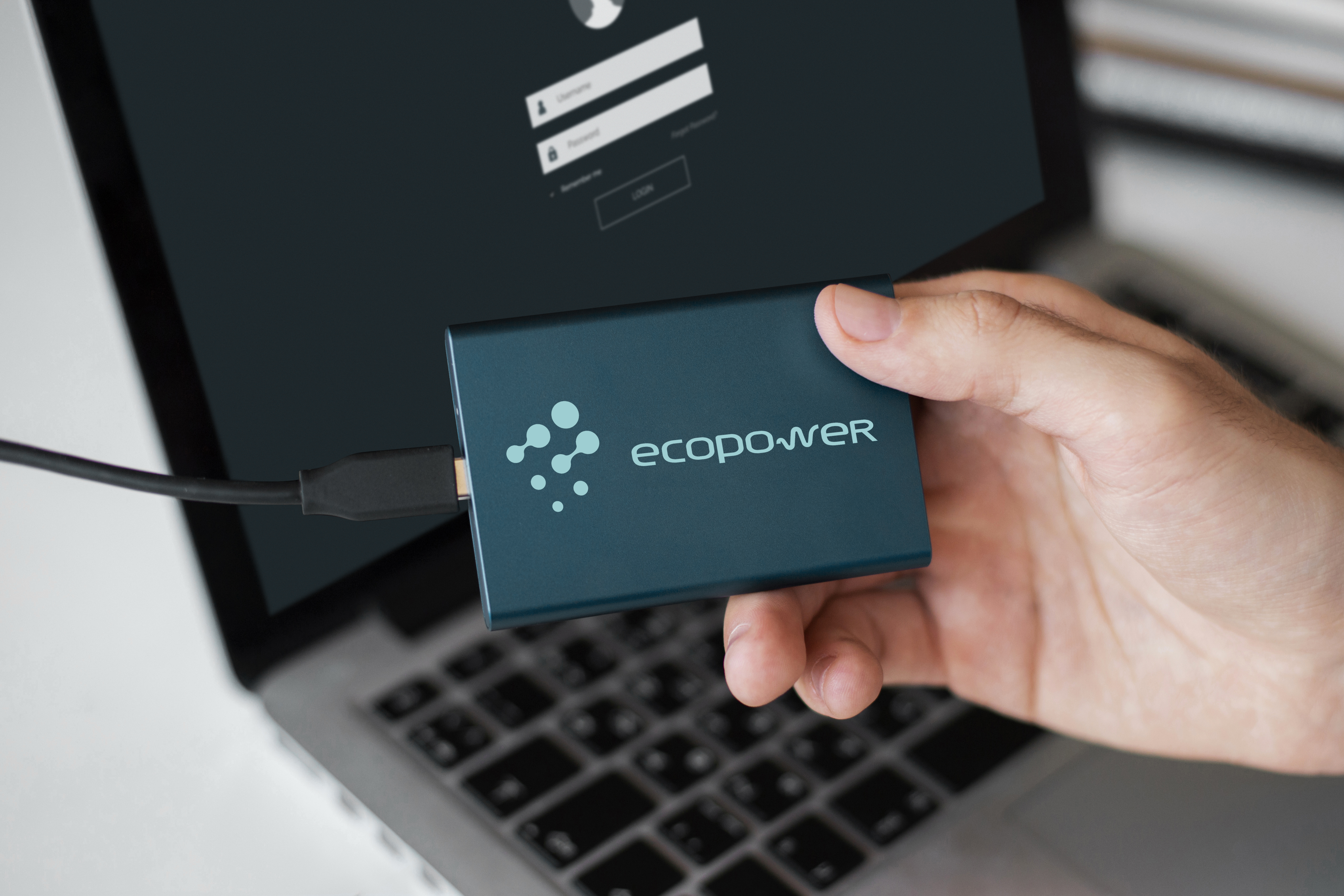
Yes, a logo is not just a beautiful picture. We always reflect the idea, meanings, take into account the target audience and a bunch of other factors. The final result is attached below.
Gallery