Corporate Identity Development for LS CLUB
Creation of corporate identity for LS CLUB. LS CLUB is a closed international community of experts from different niches, who grow and develop through unification.
The task: to meet the following criteria: modernity, premium, ambition, cryptocurrency, with reference to the future.
Stages:
1. Concept Development.
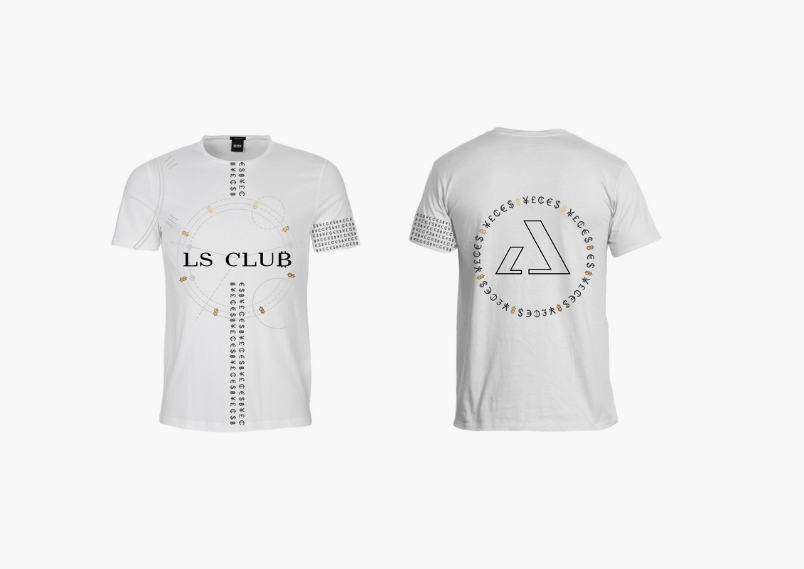
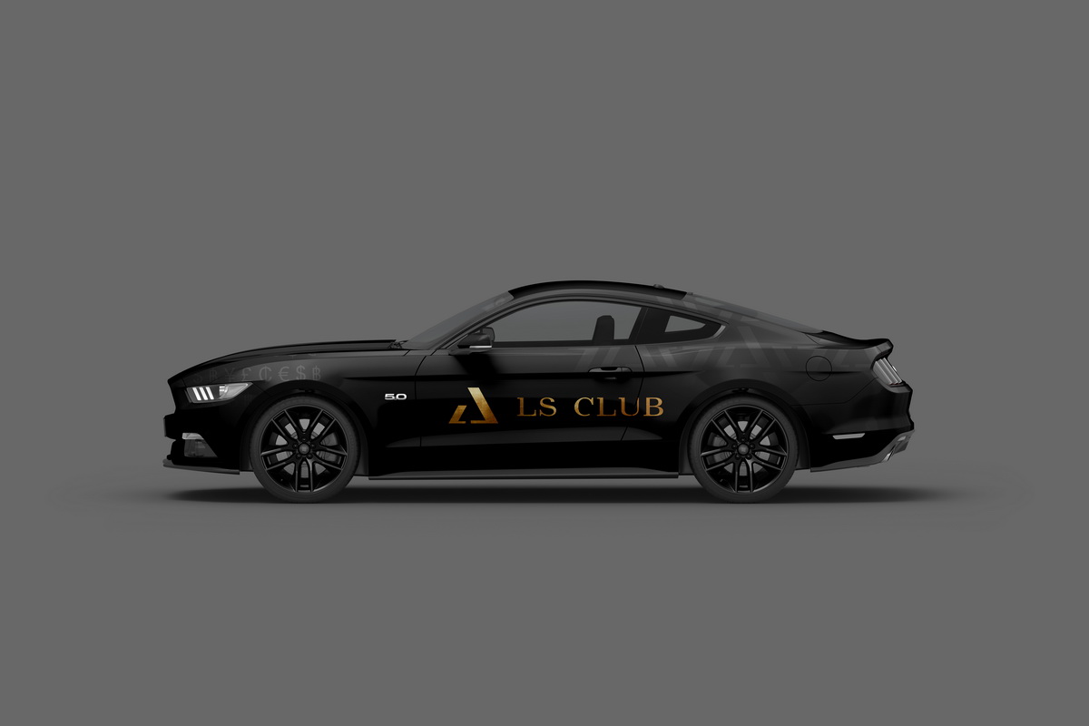
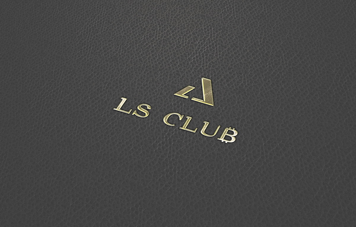
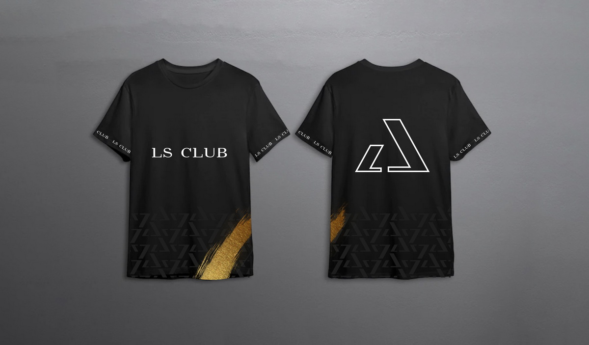
The logo concept is based on the idea of networking: silhouettes of two open laptops in profile, turned to each other. The figure "triangle" is chosen as a symbol of wealth, power and prosperity ("Eye of Horus" on the pyramid of the Freemasons).
2. Choice of palette.
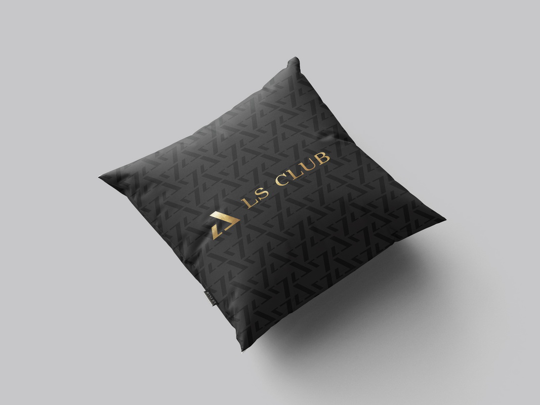
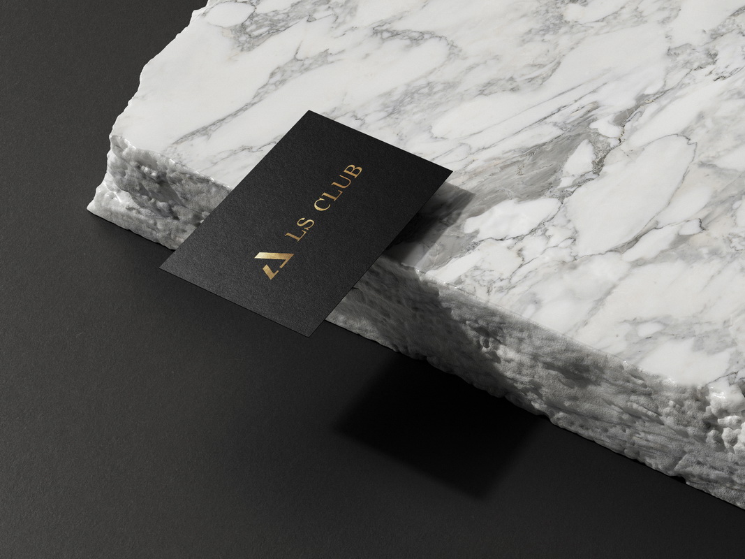
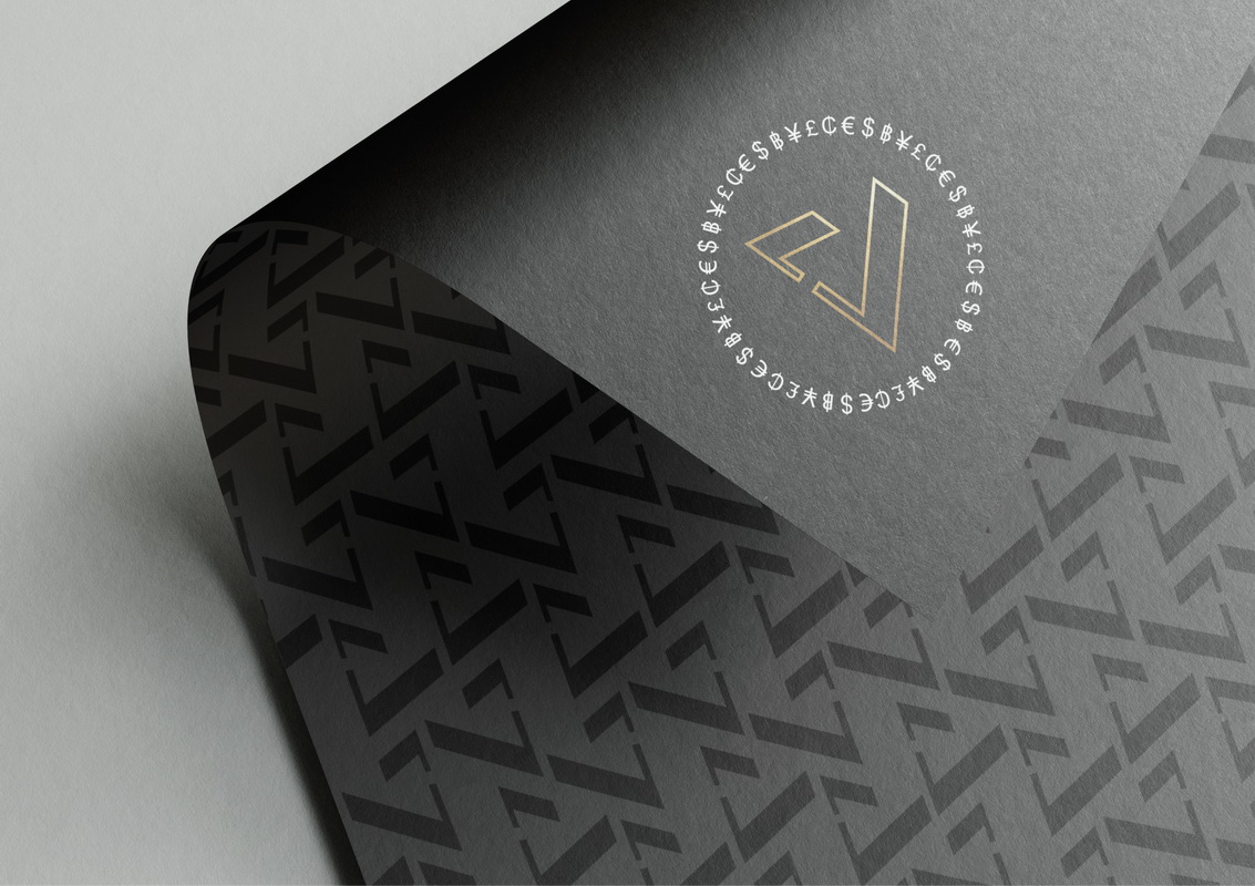
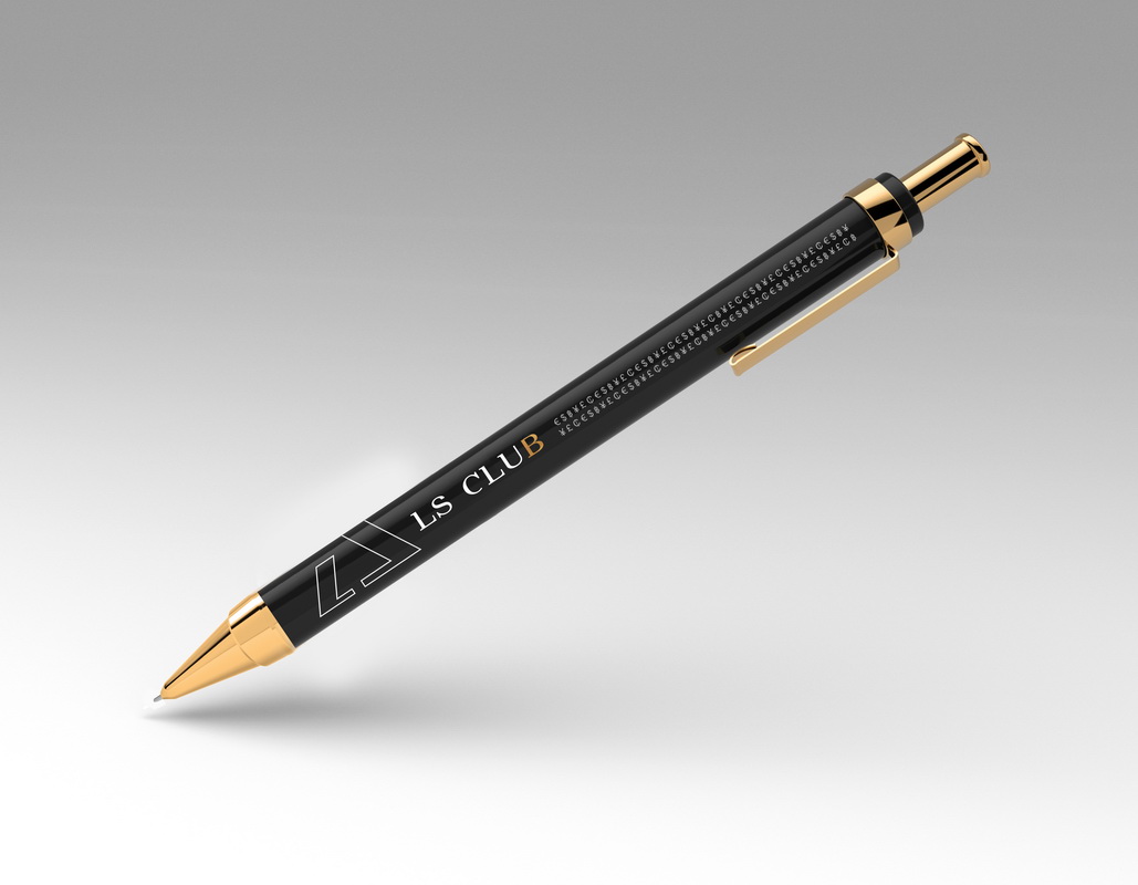
Color combinations: black, white - basic, gold - accent.
3. Drawing of different variants of the logo.
The client was offered 3 variants of the logo, in the concept of which associations of the second order were used.
4. Working with the client, choosing the final variant of the logo.
The uniqueness of the naming is given by the classic and premium font. The font in the style of "antiqua with serifs" in a modern version was developed specially for the project. The bitcoin sign symbolizes the club's activities. Key impressions from the naming: status, gloss, elegance.
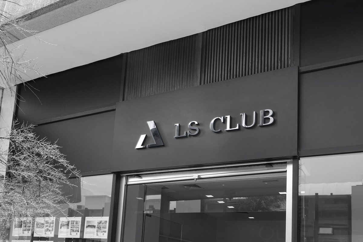
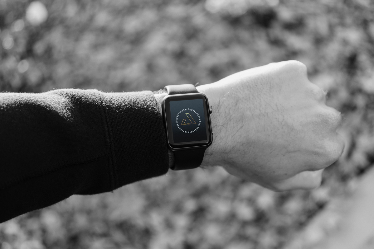
Thanks to the laconic and stylish image of the logo, it can be used as a trademark.
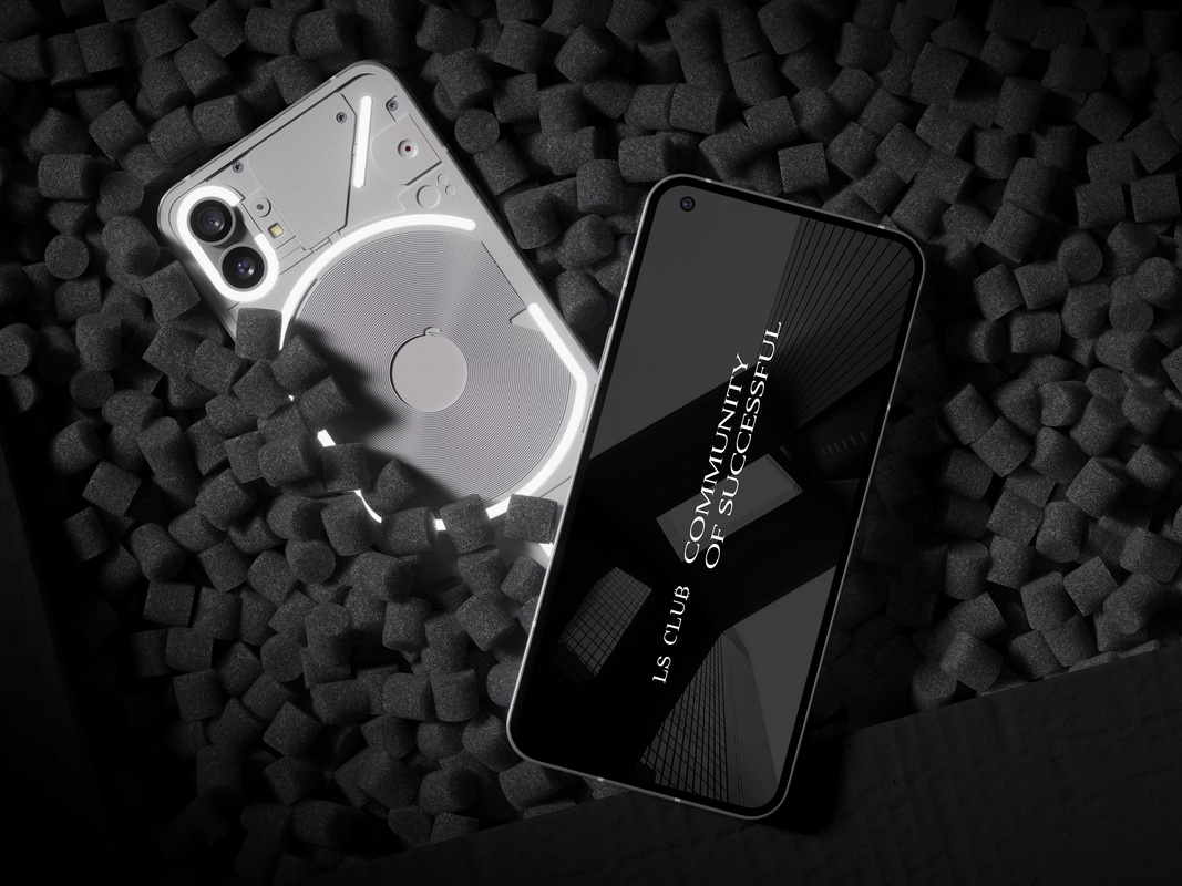
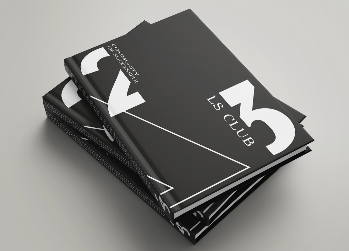
Gallery